Using Formulas to Explore the Planets
In this tutorial, you’ll use formulas to define new attributes and to plot functions. You’ll look at a data set with only nine cases—the planets in our solar system. You’ll compute the density of the planets in our solar system, and investigate the relationship between a planet’s distance from the sun and the length of its year.
Getting to Know the Planets Collection
1. Open the document Planets.ftm from the Tutorial Starters folder. There are two objects here: text, explaining the attributes (this information is also in the collection comments), and the collection of planets.
2. After reading the text, hide the text object by selecting it and choosing Object | Hide Text Object.
We did something special to this collection; we have to open it to see what it is.
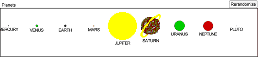
3. Open the collection by dragging its lower-right corner down and far to the right. Instead of the usual gold balls, the cases have different images in different sizes.
In Fathom, you can use formulas to turn the collection itself into a graphical representation of your data.
4. Double-click the collection to show the inspector.
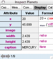
5. Go to the Display panel by clicking its tab. There are many special display attributes with formulas in them: x and y control each icon’s placement horizontally and vertically (with the origin being the top left corner); image controls the picture (by default, the familiar gold ball); width and height control image size (you can see their entire formulas without resizing—the formulas are simply the planets’ radii); and caption controls what text appears below each icon.
6. Make the inspector much wider.
7. Drag the lower border of the y row to make it taller, so you can read the entire formula.
8. Double-click the formula field for image to see how the images were determined.
9. Resize the formula editor and the top pane so you can read the whole formula.
The case images are controlled by a switch function that evaluates each case’s caseIndex (the first case has a case Index of 1; the second, 2; and so on). In this example, each case gets its own image. Fathom comes with dozens of built-in images that can be used in display formulas. (To see them all, see the sample document IconList.ftm.) See Fathom Help: Change the Appearance of Cases in a Collection for more on using this feature.
10. Click OK to close the formula editor.
11. Iconify the collection, and close the inspector.
12. Make a case table for this data. (If you select the collection first, it will fill with the data; otherwise, drop the collection’s name into the case table to connect them.)
Computing the Densities of the Planets
We’ll now have Fathom compute each planet’s density. We need to know the volume and mass for each, because density is the ratio of these values. We’ll find the volume using the radius (the attribute Radius) measured in millions of meters. The mass, measured in Earth masses, is recorded in the attribute M_Earths. We’ll compute density in two steps using two new attributes (though we could do it in one), beginning with volume.
13. With the case table selected, choose Table | Show Formulas. A new row appears; the formula cells are shaded to show that none of the existing attributes are defined by formula.
14. Add a new attribute named Volume.
15. Double-click its formula cell to show the formula editor.
The top of the formula editor holds the formula itself. You can type into the formula pane, or use the keypad and attribute and function lists to enter things into the formula.
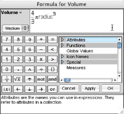
The formula we need is 4/3 π Radius³. Because this is your first formula, we’ll go step-by-step.
16. Type “4/3”. Notice that the cursor is next to the “3”, not the whole expression. You need to move out of the denominator.
17. Press the right arrow on your keyboard to move out of the denominator.
18. Type “pi*”.
Pressing the “*” key for multiplication tells Fathom that “pi” is a word (not the beginning of an attribute name, for instance), and Fathom shows the symbol π.
19. Either type radius (the formula editor is not case sensitive), or expand the Attributes list and double-click Radius. When you enter a valid attribute name, it turns magenta.
20. Type “^” to make an exponent, and “3” to cube the radius.
21. Press Enter or click OK to accept the formula and close the formula editor. The formula appears in the cell, and the attribute values have a gray background to show that they are computed.
22. Make another new attribute, Density, and give it this formula:
![]()
The numerator is the mass in Earth masses, and the denominator is the volume in Earth volumes, so the density comes out in Earth densities.
23. Graph Density.
24. Click a data point to see which planet it represents.
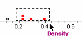
25. Select more than one data point by dragging a rectangle around a group of points.
Use selection in the graph to answer these questions.
• Which planet has the lowest density?
• What do the three planets on the right have in common?
• What do the four planets on the left have in common?
• What is special about Earth?
• If the Moon is a chunk of Earth, where would it be on this graph? (You could look it up, and see where it does lie.)
Playing Kepler
Now we’ll study one of the most famous relationships in physics—how the period of an orbit depends on the orbit’s radius. This relationship was discovered by Johannes Kepler in 1618.
26. Replace Density with orbit_AU with year on the vertical axis of the graph. You should see the points on a gentle upward curve.
It looks like we could predict how long a planet takes to go around the sun if we knew the radius of its orbit. Let’s try fitting a function.
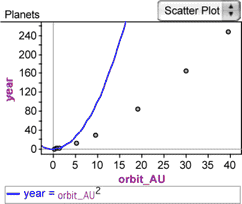
27. With the graph selected, choose Graph | Plot Function.
28. In the formula editor, enter a plausible function, such as “orbit_AU²“. A curve appears in the graph, and its equation appears below.
The curve is too steep. It looks like we need an exponent between 1 and 2. We’ll use a slider to vary the exponent until it’s right.
29. Drag a slider from the shelf.
A slider is simply a named value that, used in formulas, is a dynamic, varying parameter. By default, the first slider you make is named V1.
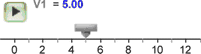
30. Double-click the slider’s name and type something more appropriate, such as exponent.
The exponent we need is between 1 and 2, so let’s expand the slider’s axis to get finer control.
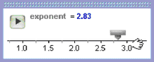
31. Drag numbers off the slider’s axis until the slider goes roughly from 1 to 2.
Now we need to get this slider into our function.
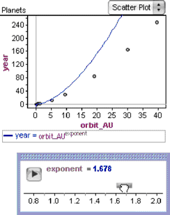
32. Double-click the function’s formula below the plot area of the graph to show its editor.
33. Replace the 2 with the slider’s name (you can find the name in the Global Values list, or simply type it), and close the editor.
34. Drag the slider’s thumb, and watch the plotted function change to reflect the slider’s value.
It looks like the function needs to be exactly halfway between 1 and 2. Let’s test this theory by editing the slider’s value directly.
35. Double-click the slider’s value to select it, change it to 1.5, and press Enter. This curve fits the data very well.
The curve’s equation is year = radius^3/2, or year² = Radius³, or, as Kepler wrote it, T² = R³, where T is the length of the year and R is the planet’s radius.
Straightening the Planets: Kepler with Logs
We can also figure out the relationship between period and radius of an orbit by taking the logarithm of both attributes.
36. Make two new attributes, logOrbit and logYear. (These are the names, not the formulas.)
37. Give them the formulas “log(orbit_AU)” and “log(year)”, respectively.
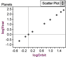
38. Make a second graph of logYear as a function of logOrbit. It looks like a line.
39. Choose Graph | Least-Squares Line. Check out the slope. Look familiar?
If T² = R³, then log(T²) = log(R²). So, 2 log(T) = 3 log(R). This means that Kepler’s law implies that the slope of log(orbit_AU) versus log(year) should be 1.5, and we see that it is.
In the graph, there is a gap between Mars and Jupiter. What goes there?
Orbits in Detail
So far, we have been looking at the orbit_AU attribute, which has each planet’s average distance from the sun. However, planets move in ellipses, not circular orbits. The collection has attributes for the minimum and maximum orbital distances for each planet: periAU and apheAU (short for perihelion and aphelion). We can add these attributes to our graph of year versus orbit_AU.
40. Drag the attribute periAU to the horizontal axis of the graph, but don’t release it yet. Notice that when the attribute is over the graph, each axis has a big, gray plus sign. When you move the cursor over it, the highlighting disappears from the axis, and the plus sign itself becomes highlighted.
41. Drop the attribute on the plus sign. The attribute is added to the axis: a second set of data points appears (blue squares rather than gray dots), and a legend appears at the bottom of the graph, telling you which kind of dot represents which attribute.
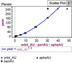
42. Add apheAU to the same axis (dropping it on the plus sign). Green triangles appear for this third attribute.
For most planets, the three values are almost on top of each other, but Pluto’s are far apart. What does this tell us about Pluto’s orbit?