Exploring Data—Census at Schools
CensusAtSchool is an undertaking project that collects and disseminates data about students from the United Kingdom, South Africa, Australia, and New Zealand.
In this tutorial, you’ll use Fathom to start exploring the data. You’ll learn how to navigate around Fathom and how to make and use graphs.
Opening the File
This tutorial uses a file from the Sample Documents collection that comes with Fathom.
1. If Fathom isn’t already running, launch it.
2. Choose File | Open Sample Document.
3. Open CensusAtSchool.ftm from the Tutorial Starters folder.
4. If the document window isn’t already maximized, click its maximize button.
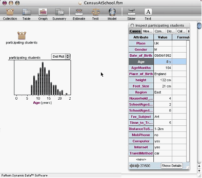
Your Fathom window should look like this:
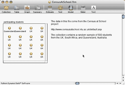
The document currently has two objects: a text object, explaining where the data come from, and a collection, which is where the data are stored. Each gold ball in the collection represents one case, which in this file is one person.
5. Put your cursor over the collection. The status bar at the bottom left of the Fathom window gives some information about the data: “This collection has 500 cases and 19 attributes, or variables.”
Inspecting the Collection
Let’s see what data we have about our students.
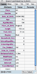
6. Double-click the collection, or select it and choose Object | Inspect Collection.
Unlike the collection and graph objects, the inspector is a window that floats above the document window. It also floats with you if you scroll down or to the side. This shows the collection’s inspector open to the Cases panel, which shows all of the attributes and the values for one case. Some values and attribute names are too long to be completely visible. You can resize the column widths by dragging a boundary between two column headings.
7. Browse the cases by clicking the arrows at the bottom of the inspector. We can see that we have some basic demographic data, such as where these students are from and their gender and age, as well as data about their households, such as how many people they live with, and other information, ranging from their heights, how they get to school, and what technologies are available to them.
Graphing Data
There are many different relationships to explore, but first let’s see where all of these students are from.
8. Drag a graph object from the object shelf into your document, or choose Object | New |Graph. You get an empty graph because you haven’t yet told Fathom what attribute to graph.
9. Drag the attribute name Place from the inspector, and drop it on the prompt below the graph’s horizontal axis. (You could, instead, have dropped it on the vertical axis.)
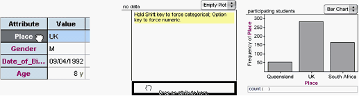
By default, you get a bar chart showing where the students live and how many live in each place. The United Kingdom has the most students in this sample, and Queensland (a state in Australia) has the fewest.
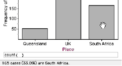
To see exactly how many students are from South Africa, hold the cursor over the bar representing the South African students, and read the status bar in the lower-left corner of the Fathom window. The status bar indicates what percentage of students come from each place. You can also show this information on the graph.
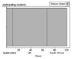 10. Use the pop-up menu at the top right of the graph to change the graph to a ribbon chart. The data appear as a single big block, representing all of the values, divided into sections; the axis is labeled with percentages
Continuing our exploration of the data one attribute at a time, let’s see how old the students are.
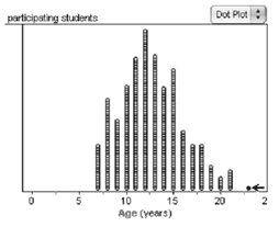 11. Drag Age from the inspector, and drop it below the horizontal axis to replace Place. Now each student is represented by a dot placed along the axis.
12. Select the oldest student by clicking their dot in the dot plot. Where is that student from? Notice that when you select a data point, the inspector shows that case. You can read all of that student’s values (this student, female, walks to school and likes English).
Is there any relationship between where students are from and their age? One way to look for relationships is to make use of the fact that a selection in one graph is reflected in another.
13. Make a second graph next to the first one and drag Place to its horizontal axis.
14. Select the bar representing Queensland students by clicking it. The bar turns red to show the selection of students. Notice that some of the dots in the dot plot have also turned red and that the students from Queensland are highlighted in the collection.
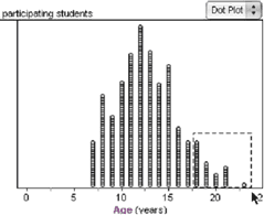
In Fathom, selecting data in one object selects them in every other object. This gives a quick, simple way of looking at relationships between attributes. You can also select a group of points by drawing a selection rectangle around them.
The two graphs show that the Queensland students are all in the middle; none are the youngest or oldest. Perhaps this is a result of how CensusAtSchool was publicized in Australia.
To get a better sense of the difference in the age ranges of the students, try looking at them in one graph.
15. Drag Place to the vertical axis of the Age graph (you can drag it from either the other graph or the inspector).
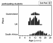
Putting a categorical attribute on a numeric graph splits the graph, allowing you to compare the age distributions of the three groups directly.
This graph shows, for example, that the narrowest range of ages is for the Queensland students; the South African students span the greatest range and have all the oldest students; and the youngest students are from the United Kingdom.
Moving, Resizing, and Deleting Objects
Before we continue exploring our data, let’s clean up the screen a little. First, we’ll delete the text object.
16. Select the text object and choose Object | Delete Text Object.
Deleting the collection would actually delete all the data, so we don’t want to do that. However, Fathom has unlimited undo, so you can always get it back. Let’s test this.
17. Delete the collection. Notice that all the graphs become empty.
18. Choose Edit | Undo Delete Collection to get it back, and then double-click the collection to get the inspector back.
Anytime you make a mistake in Fathom, you can choose Edit | Undo [action]. You can also redo anything you’ve undone by choosing Edit | Redo [action].
To clear space, we can make the collection a small icon that won’t take up much room.

19. Drag the lower-right corner of the collection up and toward the opposite corner until the object becomes iconified (that is, a little box of gold balls).
20. Move the inspector to the right of the Fathom window by dragging its title bar.
21. Delete the Place graph.
22. Move the Age graph to the left side of the window by dragging the top of its frame.
23. Finally, simplify the Age graph by removing Place. Select the graph and choose Graph | Remove Y Attribute.
Exploring Graphs
We saw how to use selection to explore relationships. Fathom also allows us to drag things in graphs. We can use this to further explore the Age graph.
24. Duplicate the Age graph by selecting it and choosing Object | Duplicate Graph.
25. Change one of the graphs into a histogram.
26. Select one of the histogram bars. This selects a strip of dots in the dot plot. Put the cursor over the selected bar to read about it in the status area: the range of values it contains and how many cases are in it.
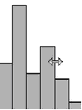
27. In the histogram, drag an edge of one of the bins to make the bins wider. Each bin now represents more cases, so some of the bins are too tall to see their tops.
The dots are now in bins, each the same width. Sometimes the choice of bin width affects the overall look of the data, for example, whether there’s one tallest bin or more than one. Let’s dynamically explore how bin width affects the histogram’s look.

28. Drag the 70 on the vertical axis down until you can see the tops of all the bins. Notice how some of the bumpiness in the histogram has been washed out with the wider bins. Selecting a bin now selects a broader strip of dots in the dot plot.
Although there are other ways of rescaling graph axes (see Fathom Help for details), the easiest is simply to drag the axes: Dragging near the ends of the axes dilates them, while dragging the middle shifts them.
29. Choose Graph | Rescale Graph Axes to see all the data.
Going Further
Using the techniques you’ve learned, answer these questions or make up your own.
- Is math more popular with males or females?
- Which place has the highest proportion of students with Internet access?
- Which country’s students have to travel farthest to get to school?
- Which place has the highest proportion of students who walk to school? Are these the students who have the greatest travel time?