Data and Prediction—Arm Span
This tutorial focuses on relationships between numeric data and linearity. Do taller people have bigger wrists? How is height related to arm span or other kinds of bone-length measurements? Which measurements allow us to best predict someone’s arm span?
Entering Data
For this tutorial, we’ll be entering data from scratch. For this, we need an empty case table.
1. If Fathom isn’t running, launch it. Otherwise, create a new, empty document by choosing File | New. (You might want to maximize your window to give yourself plenty of room to work.)
2. Drag a case table from the shelf into your document.
We need to tell Fathom what attributes we want to record.
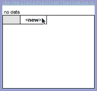
3. Click <new>.
4. Type Name for the first attribute, and press Tab.
As soon as the new name is accepted, Fathom creates an empty collection (iconified) to hold this data. The case table now has the title of that collection: Collection 1.
5. Make the table wide by dragging its right edge.
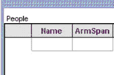
6. Add the following attributes (column heads): ArmSpan, WristCircum, Forearm, and Height.
All objects connected to a collection have that collection’s name. Let’s give this collection a more meaningful name.
7. Double-click Collection 1 in either the case table or the collection.
8. Type People in the dialog box and click OK.
9. Now we’re ready to enter the values. Click in the cell below Name.
10. Type Scott and press Tab. The Tab key moves you to the next cell. (If you’re at the end of a case, it moves you to the first cell of the next case, so you can tab your way through the whole table. See Fathom Help: Keyboard Shortcuts for more on moving within and between cells.)
11. Type 76.5 in for Scott’s height in inches, and press Tab. Because this value has a unit, a new row (the units row) appears above the first case, and the unit name appears in its cell in green. This is Fathom’s way of indicating that it recognizes the unit as a unit and that the unit applies to the entire attribute.
12. Type in the rest of the data for Scott, and press Tab to move to the first cell of the next case. After typing inches for each of the first cells, you don’t have to retype inches, as you’ll see in the next case.
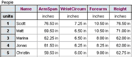
13. Type the rest of the people’s names and their measurements (just the numbers). As soon as you leave each cell that has a unit applied, Fathom inserts the unit’s abbreviation.
14. Save the document to preserve your data.
Making Scatter Plots and Analyzing Relationships
Making a graph requires two things: the empty graph and the attribute names to drag to it. In the Exploring Data Tutorial, we got the attributes from the inspector, but we can drag attributes from anywhere we see them. This time we’ll use the case table, because it doesn’t take up too much space.
15. Make an empty graph.
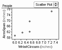
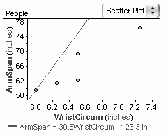
16. Drag WristCircum to the horizontal axis and ArmSpan to the vertical axis. You get a scatter plot: each dot represents one person’s wrist size and arm span. The dots are scattered, but fairly linear. You can see a positive correlation between wrist circumference and arm span—as one gets longer, so does the other.
It would be nice to see who each data point belongs to.
17. Select Name in the case table. Notice that the Table menu appears whenever the case table is selected.
18. Choose Table | Use As Caption.

19. Move the cursor to point at a data point. The person’s name now shows up in the status bar.
We can add a line to the graph to help quantify the relationship between wrist size and height.
20. Select the graph. Notice that now the Graph menu appears and the Table menu is gone. If you can’t find a menu or a command for an object, try selecting the object to make its menu appear.
21. Choose Graph | Add Movable Line. A line appears on the graph, and its equation is given below the graph. This line is not based on the data in any way. You have to move it to get it to “fit” the data.
22. Run the cursor along this line, noticing how the cursor changes shape. Experiment with using different cursors to drag the line.
23. Move the line to get a pretty good fit to the data by first dragging one end and then the other.
The line is an eyeball fit; different people will fit the line somewhat differently. Fathom can also compute several standard lines of fit. One of these is the least-squares line. Let’s find out just what that means.
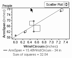
24. With the graph selected (so that the Graph menu is in the menu bar), choose Graph | Show Squares. Fathom draws a vertical line from each data point to the movable line (known as the point’s residual) and a horizontal line of the same length, creating a square for each data point. Below the graph, it reports the sum of the areas of all the squares. This sum is one way to judge how well a line fits data.
25. Drag the line around. Watch the squares and their sums change.
26. Adjust the line to make the sum of the squares as small as you can make it.
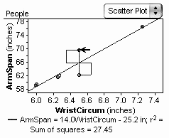
The line that minimizes the sum of the squares of the residual is the least-squares line.
27. Choose Graph | Least-Squares Line. A second line appears in the graph. This one is computed from the data and is not movable. Were you close?
28. Choose Graph | Remove Movable Line.
What does the equation of the least-squares line tell us about the relationship between wrist size and arm span? (Someone with a wrist 1 inch bigger around than another person will likely have an arm span about 14 inches longer.)
Dragging Data
In Fathom, we can drag data within graphs to change their values. This allows us to explore how changes in the data will change our analysis.
29. Drag one of the data points. Notice that while you drag, the point moves, the values in the case table change to reflect the point’s current position, the line moves (to retain its least-squares quality), and the line’s equation updates. Drag data points around in the graph, noticing how much effect each point has on the line’s equation. After exploring the effects of changing the data, we could undo all the moves until we have the original data back—but we’ll use a different method.
30. Select the collection and choose File | Revert Collection. After warning you that this step is not undoable, Fathom puts all the data back in its original state (the state at which you last saved it) without taking away the other changes that you made (the graph and its line, for example).
One way to judge how well a line fits data is to look at a residual plot.
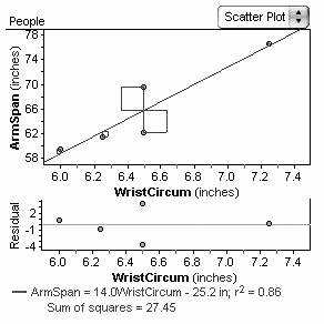
31. Select the graph and choose Graph | Make Residual Plot. A second plot appears below the graph. The horizontal axis is identical to that in the original graph, but the vertical axis isn’t labeled ArmSpan. Instead, it’s labeled Residual, which is each point’s vertical distance from your line of fit. Notice its scale.
32. Drag points in either the original plot or the residual plot to explore the residual plot.
33. When you are through, restore the original data (by undoing or reverting).
What’s the Best Predictor?
We can use a line to predict likely values when given only one of the measurements. Let’s see how well this method predicts your height given your wrist size.
34. Make a new graph with WristCircum on the horizontal axis and Height on the vertical axis. Add a least-squares line.
35. Measure or estimate your wrist circumference in inches.
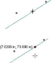
36. Click and hold your mouse over the line. The cursor changes and a red dot appears on the line.
37. With the red dot showing, drag the cursor around in the graph. The dot traces the line, and its coordinates appear in the graph.
38. Use this feature to predict your height. How far off is the prediction from your actual height?
Although you can’t measure your own arm span without help, maybe we can use this technique to predict it. Let’s look at the relationships of the other attributes to arm span to see which is best for predicting it.
Look at the graph of ArmSpan versus WristCircum. After the equation of the least-squares line, the r² value is given. The closer this number is to 1, the better the correlation between the two attributes.
We now want to graph arm span against each of the other attributes. Here’s a quick way.
39. Select the ArmSpan graph and choose Object | Duplicate Graph. You get a copy of your graph, with arm span and the least-squares line in place.
40. Replace WristCircum with Forearm by dropping Forearm below the horizontal axis. Do forearm length and arm span seem correlated?
41. Select the ArmSpan graph and choose Object | Duplicate Graph. Change the graph to show arm span as a function of height. Height and arm span are very highly correlated, aren’t they? This graph will probably give a better prediction than the Forearm graph.
42. Trace the line to see what value this data predicts for your arm span. Look at the residual plot to see how far off this is likely to be. (With help, you could see how close this prediction is to your arm span.)
Going Further
- In this tutorial, we changed how cases are captioned. Look in Fathom Help to learn how to change the captions to give a whole sentence about each person (using the concat function). Change the gold ball images in the collection to look like people and base their size and placement on the data values. (See Fathom Help: Change the Appearance of Cases in a Collection.)
- Leonardo da Vinci documented the correlation between height and arm span, as well as correlations between other human body measurements. You could research what correlations he found and collect data on friends and family to verify them.