Importing U.S. Census Microdata
Since 1790, the U.S. Census Bureau has conducted a thorough survey of the American population once every ten years. The first censuses were primarily concerned with the number of people, so the federal government could make decisions about representation and taxation. Today, the U.S. Census Bureau collects a variety of data, including age, sex, race, national origin, marital status, and education. The most detailed information published by the U.S. Census Bureau is called microdata, or data about individuals.
Using Fathom, you can import samples of census microdata from 1850 to 2000. The attributes you get depend on the questions asked in a particular year. You can use these data to explore many characteristics of the American people. This tutorial focuses first on racial diversity, then on school attendance.
Note: For this tutorial to work, your computer must be connected to the internet. If you’ve done the normal installation of Fathom, you will have the files you need in place. (If not, make sure the Fathom application folder contains the Helpers folder, which contains the ImportSpecs folder, which contains the file IPUMS_USA_InterfaceSpec.xml.)
Getting to Know the Data
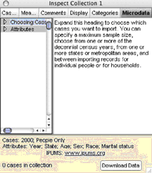
1. In a new Fathom document, choose File | Import | U.S. Census Data. You get an empty collection and its inspector open to the Microdata panel.
2. Read the help message in the inspector. Choose Attributes and read the help for that, too.
The bottom section of the panel shows the current request: By default, this is a sample of people from all over the United States (because no state or metropolitan area is selected) from the 2000 census. The attributes requested for each person are the census year, state where he or she lived, age, sex, race, and marital status.
3. Expand the Attributes list, and then the Person list. If necessary, make the inspector larger to see the whole set. (Note: You can resize the panes on this panel by dragging their edges.)
4. Click Year and Location, and read the attributes.
5. Move your cursor over Urban or Rural. The status bar at the lower left of the Fathom window shows information about the attribute that describes the attribute and tells the years for which it is available:
![]()
Skim through the list of attributes, clicking on headings of interest in the left pane, and reading about the attributes in the right pane. For now, we’ll keep the default request but add one more attribute.
6. In Education, check School Attendance.
7. Click Download Data.
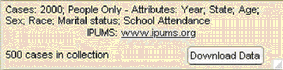
Fathom connects to the internet and submits your request to IPUMS (Integrated Public Use Microdata Series, at the University of Minnesota), which has a searchable database of census microdata samples. Fathom decodes and imports the results into a collection. (If left coded, all data would be in the form of numbers, rather than, for example, “male” and “female.”) When Fathom has finished importing the data, the lower-left corner of the inspector reports the number of cases.
Let’s explore the racial diversity of the United States as a whole and compare that with the diversity in specific regions. We’ll begin with this first sample.
8. Go to the Cases panel of the inspector to see the attribute names.
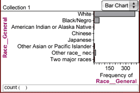
9. Make a graph of Race_General by dropping it on the vertical axis (it has long values, so it will be easier to read that way). Whites make up a substantial majority of the cases in this sample of the country.
To compare racial diversity, we’d like to quantify it. We’ll do this in two ways. First, we’ll look at the proportion of the majority race (the smaller that proportion is, the more racially diverse an area is), and then we’ll look at how many different racial groups live in an area. We’ll use a summary table.
10. Drag a summary table from the shelf.
11. Drag Race_General to the summary table and drop it on the down arrow that appears when you’re over the drop area.
12. Resize the summary table to see all of its contents.
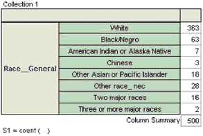
By default, the table shows the counts for a categorical attribute, but we’re more interested in the proportions.
13. Double-click the formula to show the formula editor and replace count() with columnProportion. Click OK to close the editor. The counts are replaced by proportions for each race.
Right now, we’re investigating the majority race, so we’re looking at the proportion of whites. We can make a new summary table to calculate only this proportion.
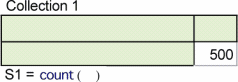
14. Make a new summary table, and drop the collection’s name in it. You get the count of the number of cases in the collection.
The collection has been connected to the summary table, so it “knows” about the collection and its attributes. We can edit the formula to calculate only the proportion of cases whose race is white.
15. Double-click the formula to show the formula editor, and delete the existing formula.
We could type the formula we want, but, instead, we’ll use the attribute and function list in the formula editor itself.
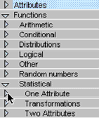
16. Open the Functions list in the middle right pane of the formula editor. (You can resize the panes by dragging their edges or resize the editor by dragging its lower-right corner.)
17. Open the list of Statistical functions, then open One Attribute.
18. Scroll down to proportion, and double-click it to insert it in the formula.
Although you can type everything into the formula editor, sometimes it’s easier (and more accurate) to choose items from the list (for example, if you don’t remember exactly what you named a particular attribute or if its name is long).
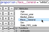
19. Open the Attributes list (Attributes appear before Functions), and double-click Race_General to insert it. Type = “White” and close the formula editor.
You have told Fathom to calculate the proportion of cases whose race value is white. (You have to enclose the value in quotation marks for Fathom to recognize it.) This expression illustrates a common formula in Fathom, where you specify for which category you want something calculated.
Now we want Fathom to calculate how many distinct racial types are in this sample.
20. Choose Summary | Add Formula (the menu won’t appear unless the summary table is selected).
21. Enter the formula uniqueValues(Race_General) and close the editor.
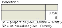 The summary table now has two statistics calculated: the proportion of whites in the sample and the number of distinct values for the race attribute. Your numbers may be a bit different from those shown here. When IPUMS has more cases available than we are asking for, we get a simple random sample. Try downloading data several times to see how much the numbers change.
We now have a rough idea of the racial diversity for the United States as a whole. We want to look at how the diversity varies around the country. When we ask for different data, our data will be replaced, so we need a record of the values we got for the country as a whole. We can make a picture of this table and keep it for future reference.
22. Make the summary table a good size—as small as possible but still showing all the information.
23. Select the summary table and choose Edit | Copy As Picture.
24. Click in a blank place in the document to deselect the table.
25. Choose Edit | Paste Picture. This isn’t a live summary table and won’t change when we change the data. (You might also want to have a picture of the graph of race.)
Changing the Cases Requested
Now we will change the request from its default of all of the country to one state.
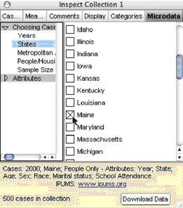
26. In the inspector, go to the Microdata panel.
27. Expand the Choosing Cases list and click States to see the list of states.
28. Pick one state by clicking its check box. Notice that your choice of state was added to the current request summary on the bottom pane of the inspector.
29. Click Download Data. The data fill whatever graphs or other objects you have (except pictures) with the new sample. Is this state more or less racially diverse than the country as a whole? (Maine, for example, is less diverse according to both our criteria: over 98% white and only four racial categories.)
School Attendance
You could continue the exploration of racial diversity, looking at different states and metropolitan areas to find the most and least racially diverse places in the United States. But let’s move on and look at some of the other attributes.
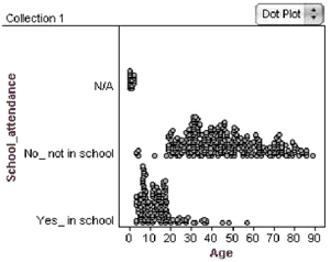
30. Make a graph with Age on the horizontal axis and School_attendance on the vertical axis. Who’s the oldest person in school now? What does N/A mean for this attribute?
Let’s look at the age range of students and the rate of school attendance over the years. The IPUMS collection has samples of data going back to 1850. It lacks data from the 1890 census (the data were lost in a fire, unfortunately) and, as of this writing, the 1930 data (which IPUMS will be adding soon).
31. Go to the Microdata panel of the inspector.
32. Click the Years heading in the Choosing Cases list.
33. Check the boxes for 1850, 1900, 1940, 1970, and 2000, and submit the request.
34. When the data come in, graph Census_year. Notice that you don’t get a dot plot; you get a bar chart, instead. Fathom is treating this attribute as categorical. (To learn more about why, see Fathom Help: Attributes with Category Sets.)
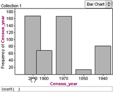
35. It would be nice to see the years in chronological order. Rearrange the bins by dragging a bin label to the correct position. Now, whenever you graph Census_year, the years will be in chronological order.
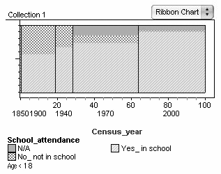
36. Change the graph to a ribbon chart.
37. Make another graph of School_attendance.
38. Select the “Yes_in school” bar. Notice the pattern of selection in the other graph. Within each vertical slice representing year, the proportion of people in school is colored red.
39. Drop School_attendance in the middle of the ribbon chart of the year. You now have a time-series display. The vertical bands are the census years, and the legend patterns show changes in proportions of the population that are in or not in school for that census year.
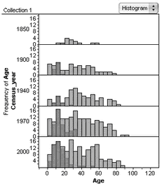
40. Make a new graph with Age on the horizontal axis and Census_year on the vertical axis. The people in school should be selected in this graph, too.
41. Change the graph to a histogram. What do these graphs tell you about schooling over time in the state you chose?
Adult Education
Our histogram showed something about the age range of those in school. We can use filtering to look more closely at the schooling of children or of adults. First let’s look at just the children.
42. Select the ribbon chart and choose Object | Add Filter. The formula editor appears.
43. The formula entered for the filter tells Fathom what cases to keep in the graph. Type the formula “age < 18” and click OK. The ribbon chart changes to show only the children, and the filter formula appears below the graph. Notice that none of the other objects are filtered; the filter applies to this graph only.
There don’t seem to be any N/A cases for the earlier years. What might this tell us about the census for those years?
If we want all our objects to be filtered, we need to apply the filter to the collection itself. Let’s look at the pattern for adult education.
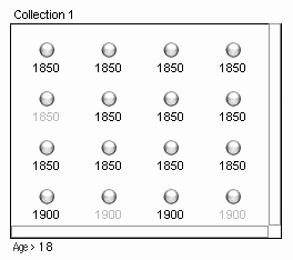
44. Select the collection and choose Object | Add Filter.
45. Type the formula “age > 18” and click OK.
The collection opens, and cases that have been filtered out are gray. Also, the filter formula appears below the cases.
Notice that the ribbon chart of children is now blank, because we’ve filtered out all the cases in that object.
46. Select the graph and choose Object | Remove Filter. The adult cases appear.
Use these graphs (and others if you wish) to explore adult education in the United States over the years.
Going Further
- Try downloading data for California in the years 1850 and 2000. Make a ribbon chart with Census_year on the horizontal axis and Sex in the middle. What do you see? What’s going on here? (Hint: Who came to California before 1850? Note: The 1850 census did not count Native Americans.) Verify your hypothesis by getting more data, such as Occupation. How long did it take for the sexes to even out? (Find out by getting some years in between.)
- Explore the idea that people now move around more than people did in the past. (Make an attribute with a formula that compares people’s current state with their birthplace, such as: if(Birthplace_General = State_FIPS_code), “Same State”, “Moved”)