|
How To... > Work with Graphs > Add Lines and Functions to Graphs > Show Measures of Spread in a Graph
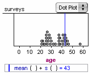
To show measures of spread in a graph (such as standard deviation), you don’t really want to simply plot the standard deviation. Suppose, for example, that your data range from 100 to 200, with a standard deviation of 30. The value wouldn’t appear on the graph, even if it were meaningful to see it there. What you want to do is to plot, say, mean plus and minus 1 standard deviation. Here’s how:
The formula editor appears.
| 3. | For this example, enter |
| 4. | Click or press Enter or Return to accept the formula and close the formula editor. |
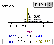
mean( ) - s( )
| 7. | Click or press Enter or Return to accept the formula and close the formula editor. |
See also
Add Fitted Lines to a Graph
|