Bar Chart


Bar Chart |
|
|
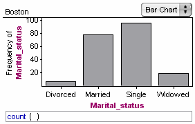
Fathom Reference > Graphs Available in Fathom > Graphs with Categorical Attributes on One Axis > Bar Chart In a bar chart, there is one bar for each category, showing the population in that category. •Drop a categorical attribute on an axis.
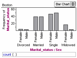
You can add one more categorical attribute to the axis of a bar chart to get one kind of splitting. See Add Another Attribute to an Already Occupied Axis.
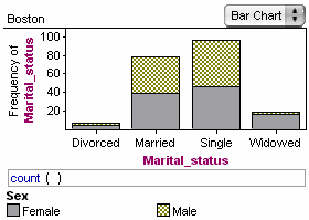
Or get a different kind of splitting by dropping another categorical attribute in the plot area.
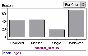
By default, the bar chart shows the count, but you can edit the formula to have the bars represent other values. (For example, by changing the formula to mean(age), you would make each bar’s height represent the mean age within each marital status category.) See Change Bar Charts to Reflect a Function Other Than Count.
You can sort the bars by choosing Graph | Sort Bars. You can rearrange the bars by dragging their labels. |