Ribbon Chart


Ribbon Chart |
|
|
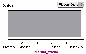
Fathom Reference > Graphs Available in Fathom > Graphs with Categorical Attributes on One Axis > Ribbon Chart In a ribbon chart, there is a single bar (the ribbon) broken into pieces. Each piece corresponds to one category; its size is proportional to the population. The axis shows percentages. •Drop a categorical attribute on an axis and choose Ribbon Chart from the graph’s pop-up menu.
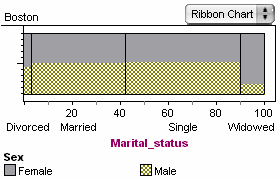
The developers of Fathom feel that the ribbon chart is a more useful graph than its better-known cousin, the pie chart. People can more easily and accurately compare rectangle areas than they can the areas of pie slices. The ribbon chart’s real power, however, comes from splitting it by dropping another categorical attribute in the plot area: Each band then shows proportions of the new attribute’s values.
In the above graph, you can easily see that there is a much smaller proportion of men among widowed people (most of that strip of the ribbon is made up of women). |