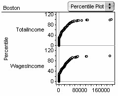
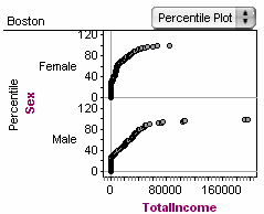
Percentile Plot


Percentile Plot |
|
|
Fathom Reference > Graphs Available in Fathom > Graphs with Numeric Attributes on One Axis > Percentile Plot
•Drop a numeric attribute on an axis and choose Percentile Plot from the graph’s pop-up menu. Split a percentile plot by adding more numeric attributes to the same axis or by dropping a categorical attribute on the other axis.
|