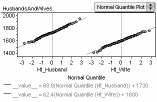
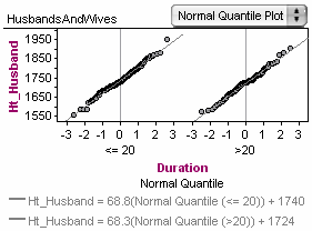
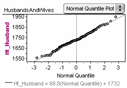
In a normal quantile plot, data are plotted against the z-score associated with the percentile of each case if the data were normally distributed. Therefore, if the data are normal, the plot should show a straight line: the greater the deviation, the less normal the data.
The line in the plot corresponds to quantiles of a normal distribution whose mean and standard deviation are the same as the mean and standard deviation of the data. If you put the attribute on the vertical axis (highly recommended), the intercept of the line is the mean of the data, and the slope is the standard deviation.
|
|