|
How To... > Work with Graphs > Add Lines and Functions to Graphs > Plot a Distribution Over a Histogram
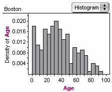
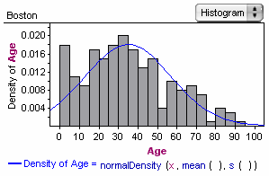
If you have a and you want to see how well it approximates a given , you can plot a function directly on the graph over the histogram bars.
This changes the graph’s axis from a frequency scale to a density scale. (The total area of the is 1.)
| 4. | Enter the for the distribution. (You can see what distributions are available and what arguments they require by opening the Functions list in the formula editor. Instead of typing numeric values for parameters, you can use functions for the data (such as mean) that get their values from the data in the graph.) |
To read about the available distributions, see Distribution Functions.
You can also have arguments in the distribution’s function linked to . See Plot a Function You Can Vary Dynamically (Using a Slider).
|